Europe
Posted on 1 January, 2015 at 9:00 PM
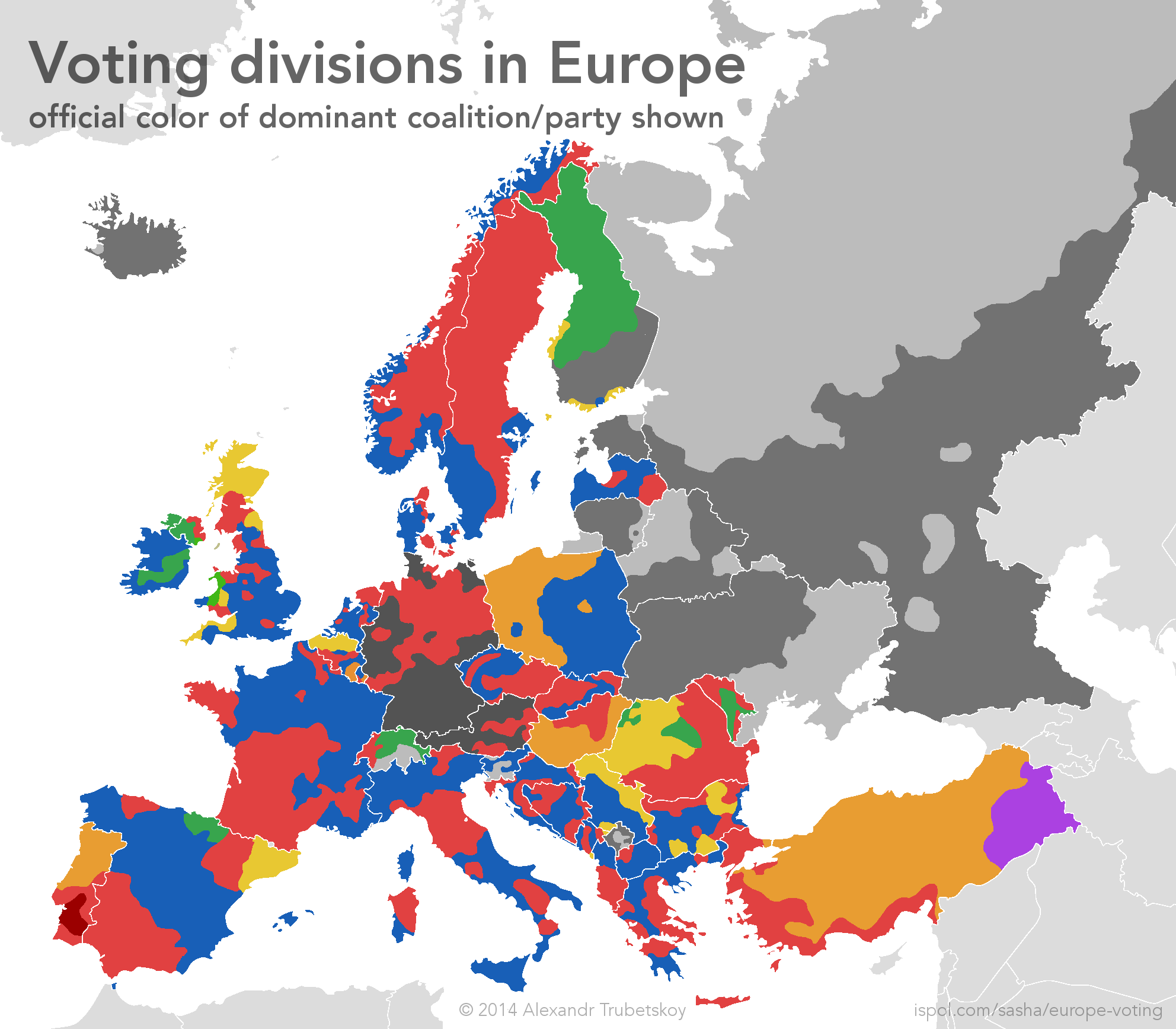
This map shows how voting divides in individual European countries cross national boundaries and have some interesting correlations.
The map speaks for itself—each color on the map is the color of the dominant/winning political party or coalition (if political parties change unreliably). In Europe, red is typically the color of leftist or socialist coalitions, while blue is typically for right-of-center or populist parties. This is opposite of the typical color scheme in the United States, where red (Republicans) is typically right, while blue (Democrats) is typically left.
The boundaries on the map are largely based on the past 10-15 years of elections, although in many cases these patterns go back much longer. In some countries, voting patterns are not tied to political parties or coalitions. Countries with grey areas do not have ideologically-aligned regions, or have special circumstances, as explained below:
- In Switzerland, the southern region receives both "FDP-The Liberals" votes, and Christian-Democratic People's Party votes, with a mixed ideology that does not match the French or German regions. This region roughly corresponds to Italian-speaking areas, although includes other towns as well.
- In Finland, the grey area is split between the National Coalition (right) and Social Democratic (left) parties. There is somewhat of a pattern, but it is not distinct enough for me to include on the map. Finnish people are welcome to contact me and suggest how the divide could be illustrated!
- In Estonia, Estonian-speaking parts are divided rather randomly between Reform, IRL and SDE parties. The only real divide is the Russian population, which overwhelmingly votes for the Center Party (Kesk).
- In Lithuania, presidential voting is fairly monolithic and parliamentary voting does not follow a consistent pattern. However, the Lithuanian Polish population represents a visible voting bloc, as indicated on the map.
- Belarus has not had a competitive election since 1994, with Alexander Lukashenko winning overwhelmingly since then. However, looking at regions where Lukashenko won but received less votes, one can still establish a pattern, as shown.
- Ukraine is in the midst of a significant crisis, and the 2014 elections did not accurately represent the political picture of all Ukrainian citizens, particularly those in the East. To construct the division on the map, the 2010 election (and prior ones) were used. The darker grey is the area with the greatest Ukrainian nationalist support, voting for Fatherland ("Batkivshyna", pro-Europe, anti Russian language) in 2012, Yulia Tymoshenko in 2010, Viktor Yuschenko in 2004. The lightest grey area contains significant numbers of ethnic Russians and is predominantly Russian-speaking in everyday language and local business. This area supported Viktor Yanukovich in 2010 and 2004. Because information was taken from elections prior to 2014, the Crimea peninsula is indicated as part of Ukraine, despite currently being adminstered by the Russian Federation.
- While elections in Russia have been marred with controversy (with many offering statistical proof of vote falsification), I used official results in creating the voting divide due to the difficulty of obtaining more statistically sound results. That being said, vote rigging/fraud does not have an impact on the location of the election boundary. Elections were analyzed from the years 2012, 2008, 2004, 2000 and 1996. Prior to 2004, the northern section offered relatively more support to Vladimir Putin and affiliated parties (inc. United Russia), while the south voted more for the Communist Party under Gennady Zyuganov. In more recent elections, the north tended to disfavor Putin and support Mikhail Prokhorov (Independent) more widely, particularly urban Moscow. The Communists continue to receive wider support in the south, and parties like LDPR currently have greater percentages in the north. More details in the case study below.
- Since Kosovo is such a young government, the election patterns are not very well established and my data is rather limited. However, as of now, the division seems to be what I have on the map. The darker grey is the Democratic League of Kosovo, while the lighter is the opposition of Serbian minorities and the Democratic Party (formerly Kosovo Liberation Army).
- Iceland is divided between Reykjavik and the countryside, with Reykjavik leaning left and the country leaning right. However, since Iceland has a multitude of parties and coalitions, there were no appropriate colors to choose that were not misleading, so I had to go with grey.
Case studies
France
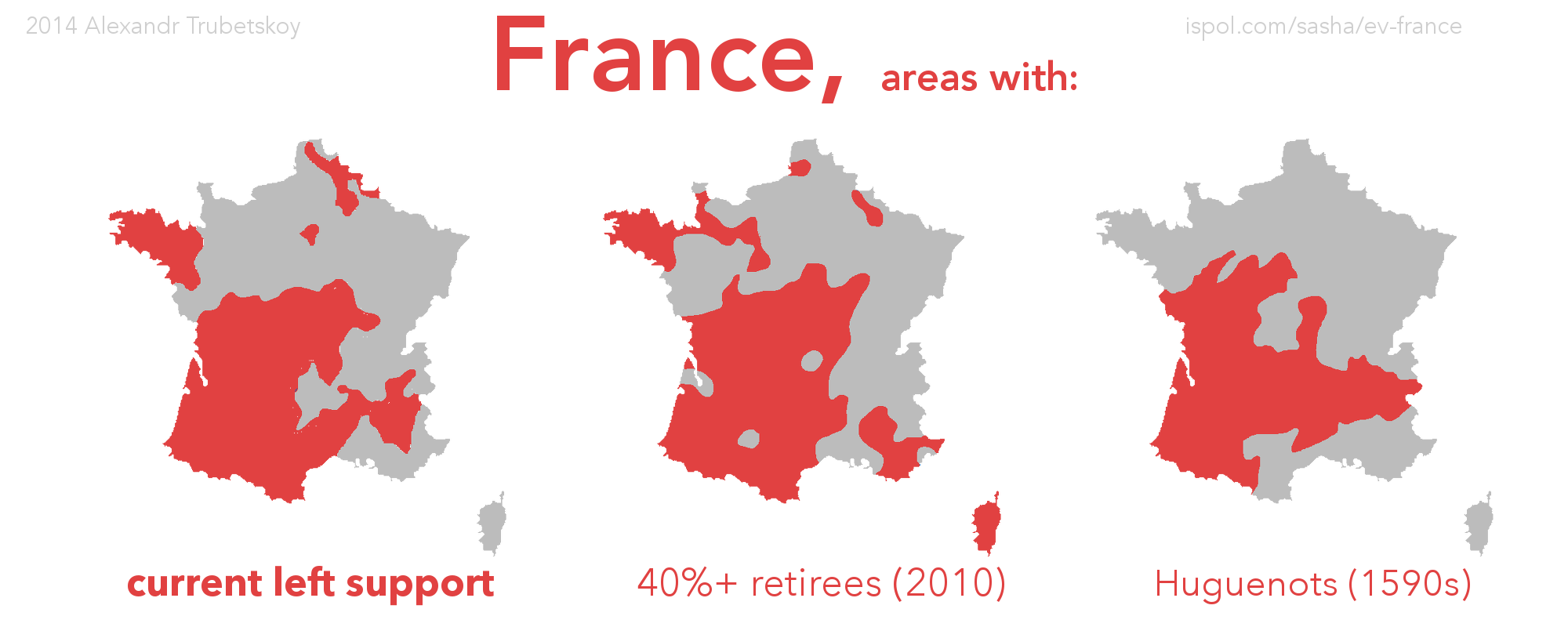
France has some interesting correlations within its election patterns. The question, as always, lies in whether or not these correlations can be linked with a causation. It seems to make sense that the older population would generally vote in favor of more left-leaning parties, securing benefits such as a lower retirement age and a greater social safety net.
But the second correlation is a little farther-fetched. The map shows territory controlled and contested by the Huguenots against the Catholics between 1585 and 1598. Nonetheless, my first thought is that the protestant Huguenots, who had a more reformed (progressive) religious confession, were more likely to be against the French establishment. The Catholic regions, meanwhile, would be more inclined to prefer the status-quo due to Catholicism's predominant cultural (and formerly political) status in France. Some areas, such as Paris, obviously deviate from this correlation. However, I think it is not unreasonable to suggest that this religious divide, which was the cause of much armed strife, imprinted itself in the nation's identity and persists in today's politics.
Here is the source for the second map (ratio of retirees to workers). The page and blog are in French, but I believe data are at the canton level and are taken from INSEE (as stated in their methodology).Like I said in reddit.com/r/France, this map is not meant to be taken too seriously. I am fully aware that correlation ≠ causation, yadda yadda. It was just interesting for me to see this pattern, so I made the map.
Ukraine
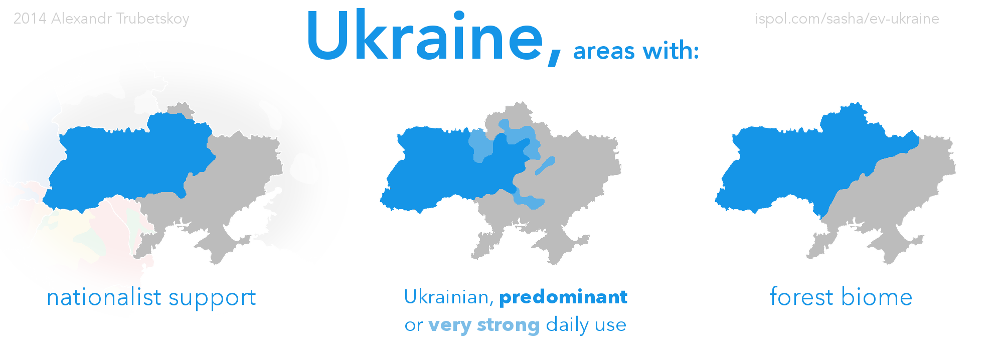
The electoral division in Ukraine is very well-publicized, with countless maps all over Western media cropping up, showing the diagonal line that splits the country roughly north-south.
As someone with a relatively close connection to Ukraine, I had always been deeply aware of this divide. But I never really thought about the root causes, beyond the idea of the Polish, Russian and Ottoman imperial boundaries.
As it turns out, the electoral line rather closely follows the line between the forested (blue) and steppe (grey) regions of Ukraine. The forested region has long been home to Slavic peoples, and was the true cradle of Ukrainian culture. The steppe, meanwhile, was historically Tatar-inhabited. And when the Tatars were removed by successive Muscovite and Russian military campaigns, the fertile steppes were suddenly prime, virgin lands for resettlement. Most of this resettlement occurred in the early 1800s, around the same time that the American Heartland was being settled by Europeans. That is why many people make the case that “Novorossiya” is as Russian as Ohio is American—a central point in the debate regarding the Russian Federation’s interests there. However, I will leave political dogma out of this discussion.
So while the forests were always Ukrainian, Polish and Belarusian, the steppes changed hands and by 1850 were settled mostly by Russian-speaking people, who spoke a southern dialect of Russian somewhere between modern standard Russian and modern standard Ukrainian (MSU). Since this dialect can be classified as both “Russian” and “Ukrainian” (as in reality it was both), you will see history books and maps disagreeing on the topic. However, it was not as similar to MSU, which was codified during Soviet times; although MSU is derived from south-Kiev (central) dialects of Ukrainian, the lexicon was infused with West-Ukrainian idiosyncrasies. This means that today, while Ukrainian grammar is similar enough to Russian to be mostly mutually intelligible, individual vocabulary words often come from very different roots.
The end result is that the steppe is populated by people closer (culturally, ethnically, politically) to Russia, while the forest continued its Polish-influenced Ukrainian legacy.
A separate, methodological note:
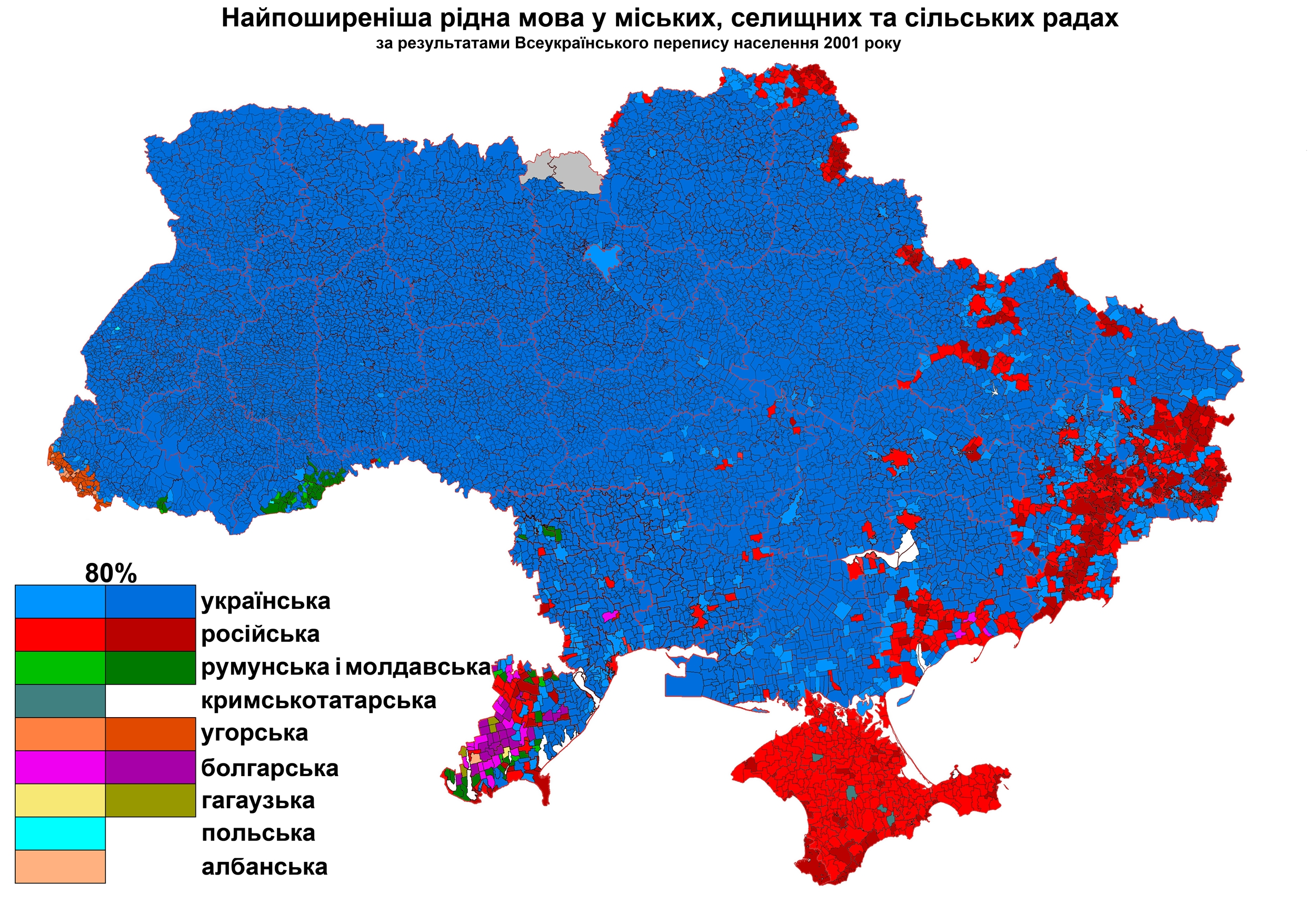
The spread and use of the Ukrainian language within Ukraine is a highly contentious issue. My map (in the middle) may surprise many Westerners who are used to seeing this map.
The map in the link shows what people consider to be their “mother tongue”. Thus, most Ukrainians, seeing as they identify as Ukrainians and live in Ukraine, will indicate Ukrainian as their “mother tongue”. However, this does not represent the linguistic reality in Ukraine. Very many ethnic Ukrainians actually use Russian more in everyday life. The “everyday life” aspect of language distribution was captured with the help of Vkontakte, Ukraine’s most popular social network, and Twitter.
An analysis of both websites shows a very similar pattern, which I generalized on my map with the help of a Gaussian algorithm.
Thus, my map represents the day-to-day language reality in Ukraine, rather than the language of government, “mother” or “native” tongue, or other misleading indices.
Related Projects