This page has been moved to Freestyle Geographic and will no longer be maintained.
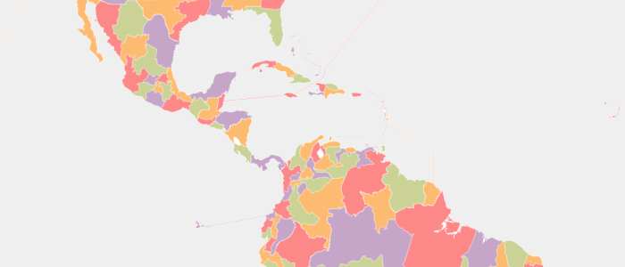
Catholic provinces
How the Roman Church divides up the world
Originally, the Roman Catholic Church organized its administrative hierarchy based on the borders of the Roman Empire's provinces. But while Rome fell 1500 years ago, the Catholic Church is alive and growing. What do the last relics of Ancient Rome look like today?
View Project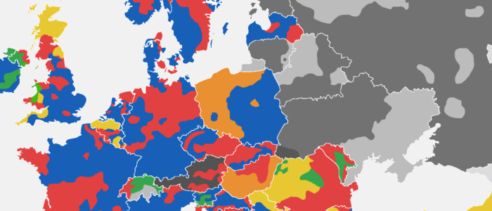
Europe
A house divided
Many of us have seen the map of Poland's east-west voting divide, which closely resembles the German Empire's borders. But what about other countries? Looking at the fascinating mosaic of European voting patterns exposes each country's unique factors.
View Project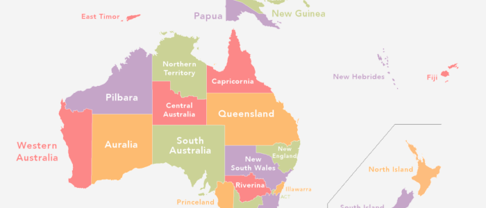
Australia
If all 24 state proposals had gone through
Australia has had its fair share of proposed states and territories. But how would it look Down Under if all 24 major proposals had succeeded? Along with a nice, colorful map, I went ahead and calculated the population, area and GDP for each of the new states.
View Project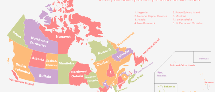
Canada
Had all 36 province proposals gotten their way
36 provinces? Are there even that many people in Canada? Many of these proposed areas would not have many inhabitants. But the idea of a Canadian Caribbean dominion definitely sounds enticing; the map and sortable info table may offer some surprises.
View Project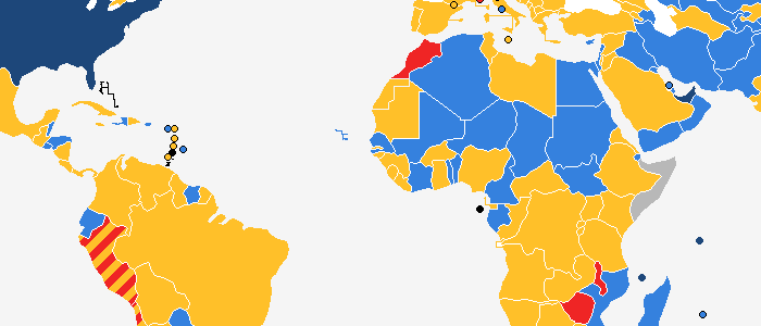
Russian
What gender is your country in Russian?
Whether it be masculine, feminine or neuter, a country's grammatical gender has more to do with its spelling than with its actual characteristics. Yet there seems to be a very clear, historically-based pattern for exactly which gender a country has within the Russian language.
View Project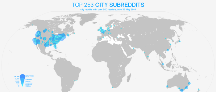
Subreddits
Reddit's largest communities across the globe
Clearly, most of Reddit's readership comes from the United States. But for many cities, Reddit has become a forum to link up and discuss community issues. I sifted through every major city (manually!) to see which places top the list of largest city subreddit.
View Project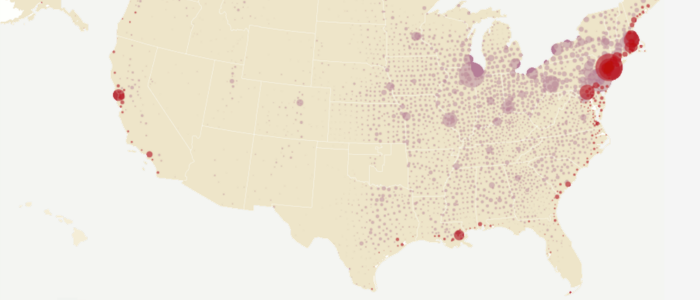
Counties
Animation: visualizing the peopleing of America
These maps were created by the US Census Bureau; I merely animated it into a .gif format. While the map has its misleadings (New York is five separate counties; LA is one), I've probably watched the little dots crawl from coast to coast at least a hundred times.
View Project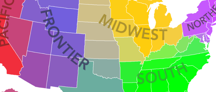
America in five regions
How do people intuitively divide the states?
What exactly is "the Midwest"? Would you put California with New Mexico or Washington? A survey of over 600 responses shows how Americans mentally divide the United States in five regions.
View Project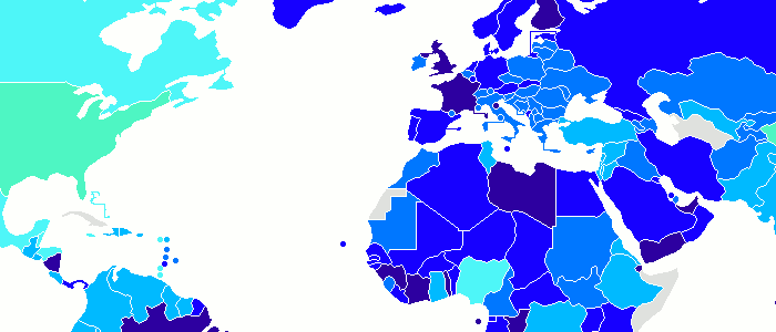
Minimum paid vacation worldwide
One thing America and China have in common
Most countries require employers to provide a certain minimum number of days paid vacation (aka holiday). France and its former colonies are especially noticeable on this map. Brazil is somewhat of a surprise!
View Project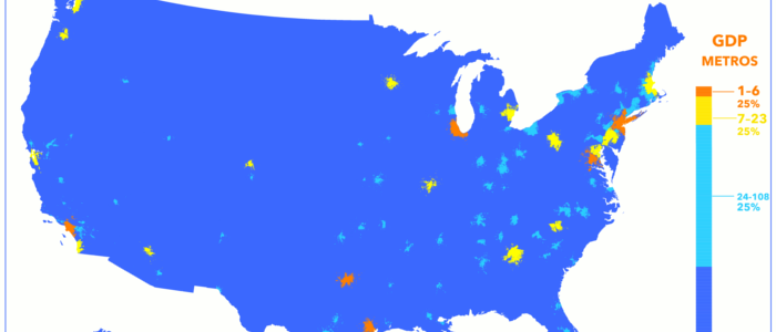
The US economy divided by metro areas
Six cities produce a quarter of the nation's economy
America's service- and consumption-based economy is concentrated in the cities. This map shows just how much this density matters when it comes to computing GDP. Dallas and Houston are economic "dragons" when it comes to city GDP.
View Project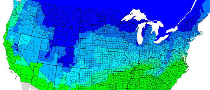
Snow days
How much snow does it take to close schools?
Made with hundreds of crowd-scourced data points, this map shows just how much snow it "typically" takes to cancel grade school in America. There are, of course, some caveats.
View Project